Background & Opportunity
Veyo operates within the Non-Emergency Medical Transportation (NEMT) industry, ensuring patients without access to vehicles can reach their medical appointments. States contract brokers like Veyo to manage trips between medical facilities and transportation providers.
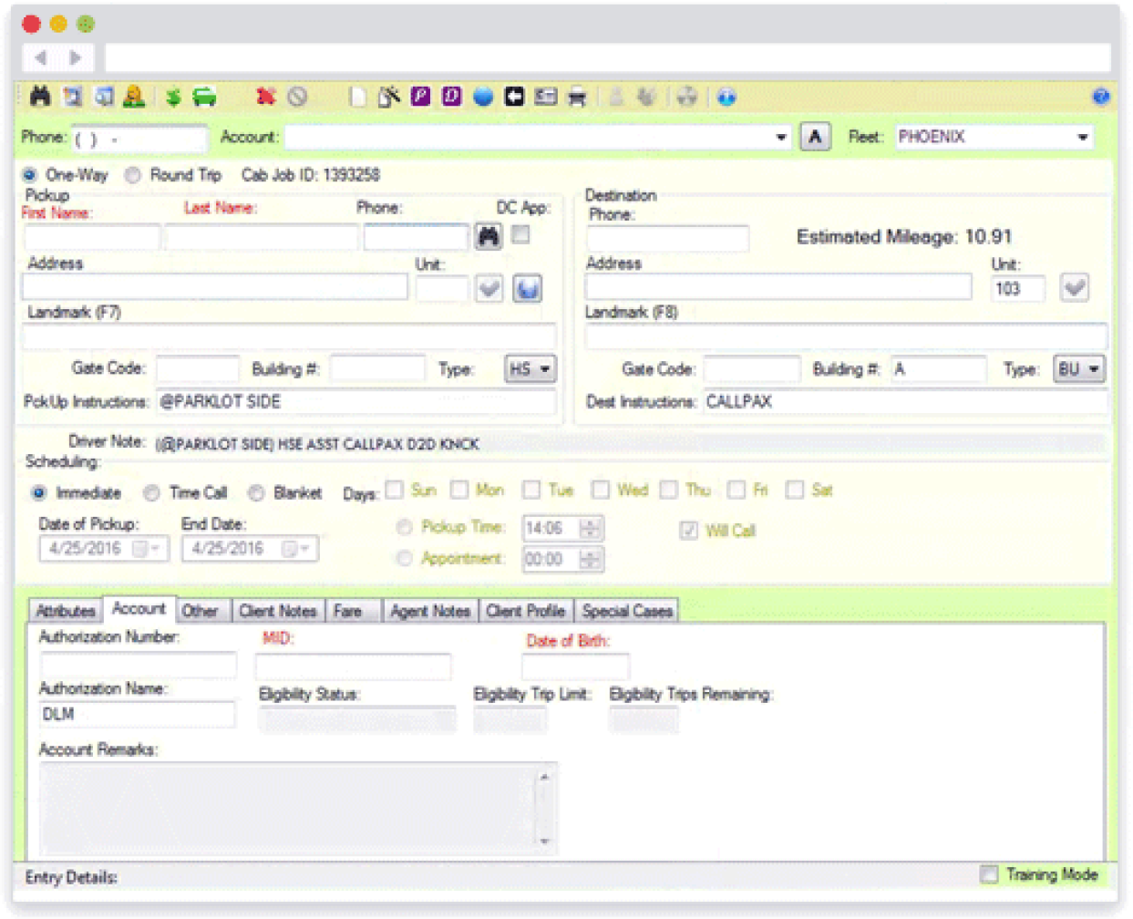
Unlike traditional brokers, Veyo runs its own rideshare driver network — similar to Uber or Lyft — giving it more control over efficiency and cost. However, its reliance on the legacy TES system caused critical billing and usability issues, creating both financial losses and operational frustration.
To address this, my team was given the mandate to replace TES with a new app that accomplished the following goals:
Prevent any unbillable trips from being booked
Increase average weekly bookings by 10%
Reduce average booking time from 5:00 to 4:00

Understanding the Problem
While we needed to understand the criteria for trip eligibility and what was missing from TES to properly evaluate that, we were also interested in improving the general trip booking experience at our user's facilities as a method of increasing usage.
My product manager and I conducted internal interviews and external site visits to find that:
Complex state compliance rules were not verifiable in TES because it wasn't designed for healthcare. Veyo had a manual trip QA team that was responsible for cancelling ineligible trips, but this approach was prone to error and miscommunication.
Frequent staff turnover at medical facilities lead to frustration from Facility Administrators who felt that they were constantly re-training staff on an overly-complex software
Users didn’t trust TES due to software bugs, and a lack of trip tracking features that were perceived as leading to missed trips

We decided that all of these issues needed to be addressed in order to meet our success metrics, and to tackle them by aiming for a simple and clear design that collected all required information and utilized familiar UI paradigms found in ridesharing apps.
Design Exploration, Validation, & Implementation
At low fidelity, I explored three flow concepts ranging from single-page forms to multi-step guided flows inspired by ridesharing apps, and comparably complex booking experiences like airfare checkout and tax filing systems.

Each option varied in how much guidance it provided versus how much it maximized the information collected per screen. I tested these over two rounds of remote interviews with facility administrators in order to find the right balance between cognitive load and perceived speed.
The results found that the progressive disclosure (i.e. showing fewer fields per screen) used in the longest flow most effectively reduced cognitive load and still felt completable in an acceptable amount of time. This is the option that I chose to pursue.
With the direction validated, I designed the high-fidelity version of RideView and presented the flow to leadership for approval. I partnered with my product manager and engineers to translate the design into tickets and provide specs for unclear interactions, in addition to contributing front-end code for select pages to accelerate delivery.
Results & Reflection
We launched RideView with a phased rollout in Arizona, our largest market, in Summer 2019.
Within the first 6 weeks of release, we were meeting our success metrics:
No unbillable trips had been booked through RideView
Average booking time was reduced to 3:30 (goal exceeded)
Weekly average bookings increased by 15% (goal exceeded)
However, a subset of users voiced frustration that the flow felt longer and more constrained compared to TES. Some of this was unavoidable, as our primary goal involved the introduction of more stringent validations, but it wasn’t expected that the market sentiment would be so misaligned with our user research findings.
Upon reflection, there were a few things that could have caused this:
Due to how busy these facilities were, we had limited access to front-desk staff, who were the most frequent users. Most testing was done with administrators, who had different priorities and values.
The design was targeted at net new users (projected to comprise the vast majority of users in the medium-long term), but most early adopters were TES veterans who valued speed over simplicity.
My design process at this time was not very collaborative - most people in the company didn't see the work until it was near completion. While this may not be directly at fault for RideView's issues at launch, I can't help but wonder if collecting more feedback from my team would have allowed us to identify them earlier
Our Response
While the business still agreed that we should be primarily accommodating for new users, the feedback post-launch led us to consider whether we had struck the correct balance between guidance and speed. With Leadership’s approval, I revisited earlier concepts to reduce friction while preserving clarity.
The updated workflow:
Reduced the number of pages from 4 or 5 to 3
Reduced the number of progressive clicks per page from 3 or 4 to 1
Removed data inputs that were traditionally collected in NEMT but extraneous to patient eligibility
Follow-up site visits with front-desk staff confirmed that the revised design felt faster and more familiar.
Although I left Veyo before development of the update was completed, this experience left me with two key learnings that I was able to apply in my next position at CommerceBear:
Testing with representative user groups is key. That’s not to say that there isn’t value in testing with others, but we likely would have avoided the negative user sentiment at launch if I had included front-desk staff in my low-fidelity design testing.
My design process required increased collaboration (both internal and external) in order to reduce unknowns and raise the probability of success.

